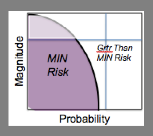
We talk about minimal risk as if it were a constant that everyone agrees on. In fact, no one agrees. Looked at as a curve, it makes a pretty graphic. But where should the arc be?
Risk Evaluations causes IRB Inconsistency
Frequency is a measurable part of risk but what it means to you or me or Dick or Jane can differ dramatically. Theory goes out the window when you get 100 IRB members from 100 different IRBs looking at 100 protocols. What is the risk from asking a participant about suicide? In a PTSD study? In a high school setting? With doctor reviewers or sociologist reviewers? There will be little agreement.
Visual Representation
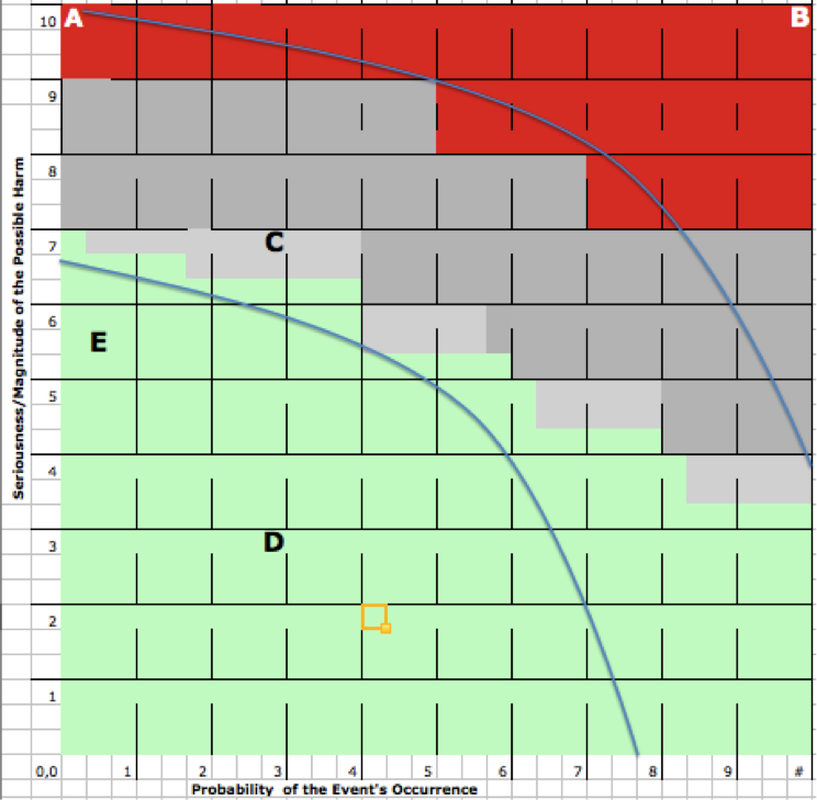
For some readers a visual representation of what is meant by minimal risk or how it is determined might help. Here are two that we use to show that the definition is a moving target but that one can determine what is definitely within the curve or not.
This first iteration is the simple representation. Imagine two IRBs; one in a very risk accepting institution and one in a very risk averse institution. The shape and size of the area considered minimal risk will vary greatly.

A Tool for your Recreation
Remembering that this is only about “minimal risk” as used in the regulations, try this with colleagues. Using several examples, ask two things: where would they place the risk on the graph and would they call it minimal risk or not. From there draw a new curve. It likely is not either of the two current curves.
Point A represents a infinitesimally small risk of death. It exists but is not measurable. Does that make it minimal if it can’t even be counted? Here it is below the top curve. Should this square be red or gray or green?
Point B represents a clear risk of death. It is certainly far greater than minimal risk if compared to the risks ordinarily encountered in daily life of Everyman. This square is obviously red.

Here are three examples you could start with. Once they are on the map, draw a new curve.
C. Risk of future genetic identification.
D. Risk of a bruise from a needle stick
E. Risk of suicide from saying “suicidal thought” to at risk youth.